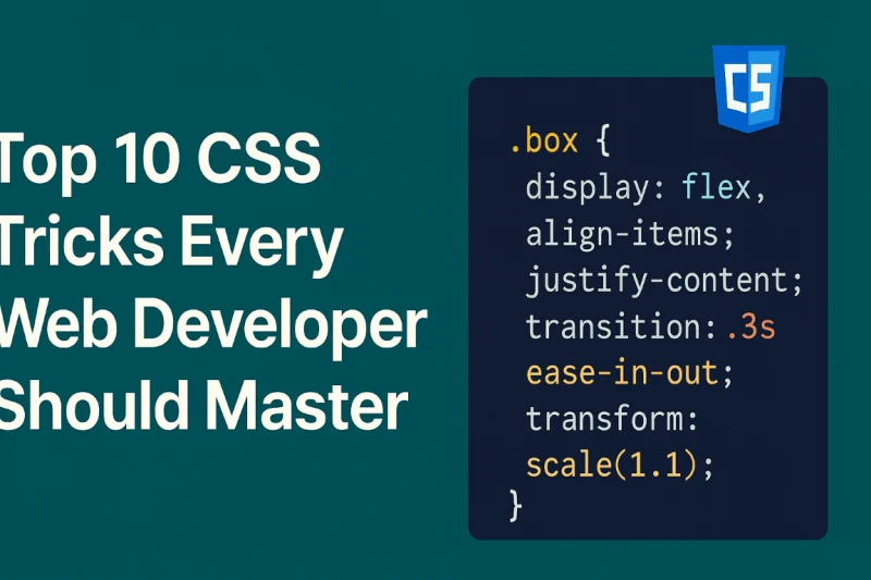
Top 10 CSS Tricks Every Web Developer Should Master

Whether you're a beginner or an experienced web developer, mastering CSS is a must. In this blog, we’ll walk through 10 powerful CSS tricks that can elevate your frontend skills and make your UI stand out. We’ll also include simple code examples to help you understand better.
1. Center Anything with Flexbox
.center {
  display: flex;
  justify-content: center;
  align-items: center;
  height: 100vh;
}
Why it matters: Flexbox makes it super easy to center elements vertically and horizontally.
2. Responsive Font Size Using Clamp
h1 {
  font-size: clamp(1.5rem, 5vw, 3rem);
}
Why it matters: This keeps your font size fluid between devices.
3. Text Truncation with Ellipsis
.truncate {
  white-space: nowrap;
  overflow: hidden;
  text-overflow: ellipsis;
}
Why it matters: Useful when you want to show preview of long text content.
4. Custom Scrollbar Styling
::-webkit-scrollbar {
  width: 10px;
}
::-webkit-scrollbar-thumb {
  background: #888;
  border-radius: 10px;
}
Why it matters: Adds polish to your UI when used properly.
5. Smooth Scroll Behavior
html {
  scroll-behavior: smooth;
}
Why it matters: Adds a modern, smooth transition effect when navigating anchor links.
6. CSS Variables for Theming
:root {
  --primary-color: #4f46e5;
}
.button {
  background-color: var(--primary-color);
}
Why it matters: Easily update themes across your entire site.
7. Image Hover Zoom Effect
.image:hover {
  transform: scale(1.1);
  transition: transform 0.3s ease;
}
Why it matters: Creates a cool zoom-in effect that improves UX.
8. Glassmorphism Effect
.glass {
  background: rgba(255, 255, 255, 0.1);
  backdrop-filter: blur(10px);
  border-radius: 10px;
  border: 1px solid rgba(255, 255, 255, 0.2);
}
Why it matters: Gives a modern, frosted glass UI effect.
9. Responsive Grid Layout
.grid {
  display: grid;
  grid-template-columns: repeat(auto-fit, minmax(250px, 1fr));
  gap: 20px;
}
Why it matters: Automatically adjusts grid layout based on screen size.
10. Animated Gradient Background
@keyframes gradient {
  0% { background-position: 0% 50%; }
  50% { background-position: 100% 50%; }
  100% { background-position: 0% 50%; }
}
.animated-bg {
  background: linear-gradient(-45deg, #ee7752, #e73c7e, #23a6d5, #23d5ab);
  background-size: 400% 400%;
  animation: gradient 15s ease infinite;
}
Why it matters: Adds dynamic feel to landing sections or headers.
Final Thoughts
Start by experimenting with these tricks in your next project. They're beginner-friendly but powerful enough to make your website feel modern and professional.
✍️ Author
dilshad

